Time picker and custom entries in Preference Fragment made simple 🕒
An overview of the fastest and cleanest way to implement a custom preference in Android, using a (themed) time picker as example

The standard preferences implemented using the PreferenceFragmentCompat in Android are surely a good and fast solution to get a functional settings screen. However, a standard settings screen implemented in this way have some limits: for example, only a limited set of setting types is supported, and the screen layout is out of our control.

In this article, i’ll focus on the time picker, since it’s a good example of custom preference entry, but the same approach can be applied to almost every type of custom preference. I’ll post and comment the code and a link to a project where i originally used this solution to implement this and other custom preference entries. It will be quite simple, don’t worry! I’ll use Kotlin and every best practice i’m aware of. Let’s go!
Step 1: have a preference screen
First thing first, you need a preference screen implemented using PreferenceFragmentCompat, which at the time of writing is the most modern solution. This means that you should have:
- A Settings Fragment implementing PreferenceFragmentCompat
class SettingsFragment : PreferenceFragmentCompat(), OnSharedPreferenceChangeListener {

    // Create the screen, given the xml containing the preferences
    override fun onCreatePreferences(savedInstanceState: Bundle?, rootKey: String?) {
        setPreferencesFromResource(R.xml.preferences, rootKey)
    }

    override fun onResume() {
        super.onResume()
        // Set up a listener whenever a key changes
        preferenceScreen.sharedPreferences
            .registerOnSharedPreferenceChangeListener(this)
    }

    override fun onPause() {
        super.onPause()
        // Unregister the listener whenever a key changes
        preferenceScreen.sharedPreferences
            .unregisterOnSharedPreferenceChangeListener(this)
    }
    override fun onSharedPreferenceChanged(sharedPreferences: SharedPreferences, key: String) {
        when (key) {
            "theme_color" -> activity.recreate()
            "accent_color" -> activity.recreate()
        }
    }
2. An xml in res/xml/preferences.xml containing the structure of the screen
<?xml version="1.0" encoding="utf-8"?>
<PreferenceScreen xmlns:android="http://schemas.android.com/apk/res/android"
    xmlns:app="http://schemas.android.com/apk/res-auto">

    <PreferenceCategory
        android:key="app_behavior"
        android:title="@string/app_behavior"
        app:icon="@drawable/ic_app_behavior_24dp">

        <SwitchPreference
            android:defaultValue="false"
            android:key="hide_images"
            android:summaryOff="@string/hide_images_off"
            android:summaryOn="@string/hide_images_on"
            android:title="@string/hide_images"
            app:iconSpaceReserved="false" />

        <SwitchPreference
            android:defaultValue="false"
            android:key="only_fav"
            android:summaryOff="@string/only_fav_off"
            android:summaryOn="@string/only_fav_on"
            android:title="@string/only_fav"
            app:iconSpaceReserved="false" />

        <SwitchPreference
            android:defaultValue="false"
            android:key="surname_first"
            android:summaryOff="@string/surname_first_off"
            android:summaryOn="@string/surname_first_on"
            android:title="@string/surname_first"
            app:iconSpaceReserved="false" />

    </PreferenceCategory>

    <PreferenceCategory
        android:key="customization"
        android:title="@string/customization"
        app:icon="@drawable/ic_customization_24dp">

        <ListPreference
            android:defaultValue="system"
            android:entries="@array/themes"
            android:entryValues="@array/themeValues"
            android:key="theme_color"
            android:summary="%s"
            android:title="@string/theme_name"
            app:iconSpaceReserved="false" />

        <ListPreference
            android:defaultValue="aqua"
            android:entries="@array/accents"
            android:entryValues="@array/accentValues"
            android:key="accent_color"
            android:summary="%s"
            android:title="@string/accent_name"
            app:iconSpaceReserved="false" />
    </PreferenceCategory>
</PreferenceScreen>
In the example above, the screen (which is just a normal fragment and can be part of the normal navigation of the app) is created using an xml (which is NOT a layout) containing the preferences, and a listener is used to refresh the activity whenever the theme or the accent changes. This kind of action is necessary only if a certain setting requires further steps, other than simply updating the SharedPreferences entry. The XML defines two option categories with an (optional) icon. the “%s” represents the actual value of the option, taken from the list of possible values.
Step 2: define a layout for the custom preference
The first step to add a time picker is to define a custom “row” to use in the preference screen. The layout will simply contain the design of the row itself. Let’s design a layout which resembles a normal preference row:
<?xml version="1.0" encoding="utf-8"?>
<LinearLayout xmlns:android="http://schemas.android.com/apk/res/android"
    android:id="@+id/timePicker"
    android:layout_width="match_parent"
    android:layout_height="wrap_content"
    android:orientation="vertical"
    android:paddingHorizontal="@dimen/settings_row_padding"
    android:paddingVertical="@dimen/settings_row_padding"
    android:hapticFeedbackEnabled="false"
    android:background="?attr/selectableItemBackground">

        <TextView
            android:id="@+id/timePickerTitle"
            android:layout_width="match_parent"
            android:layout_height="wrap_content"
            android:text="@string/notification_hour_name"
            android:textAppearance="@style/TextAppearance.MaterialComponents.Body1" />

        <TextView
            android:id="@+id/timePickerDescription"
            android:layout_width="match_parent"
            android:layout_height="wrap_content"
            android:text="@string/notification_hour_description"
            android:textAppearance="@style/TextAppearance.MaterialComponents.Body2"
            android:textSize="@dimen/custom_preference_text_size"/>

</LinearLayout>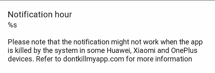
The appearance matches the standard texts, the size is 14sp and the padding is 16dp, fyi. The text is a bit longer than usual, but you can use a standard, one line description. The newline, of course, is obtained using “\n” inside the string, and the warning i wrote is notification related, since this particular time picker will contain the time to send a notification. Also, remember that any change in the text of this row must be managed manually.
Step 3: create a class for our time picker preference
Now we need a class to manage the interactions with the custom row we’re creating. The class should implement Preference and OnClickListener, and manage the time picker itself and the update of the text in the row. No more, no less.
// A custom preference to show a time picker
class TimePickerPreference(context: Context?, attrs: AttributeSet?) : Preference(context, attrs),
    View.OnClickListener {
    private lateinit var sharedPrefs: SharedPreferences
    private lateinit var currentHour: String
    private lateinit var currentMinute: String
    private lateinit var binding: TimePickerRowBinding
    val formatter: DateTimeFormatter = DateTimeFormatter.ofLocalizedTime(FormatStyle.SHORT)

    override fun onBindViewHolder(holder: PreferenceViewHolder) {
        sharedPrefs = PreferenceManager.getDefaultSharedPreferences(context)
        currentHour = sharedPrefs.getString("notification_hour", "8").toString()
        currentMinute = sharedPrefs.getString("notification_minute", "0").toString()
        super.onBindViewHolder(holder)
        binding = TimePickerRowBinding.bind(holder.itemView)

        // Format the time correctly
        val currentTime = LocalTime.of(currentHour.toInt(), currentMinute.toInt())

        binding.timePickerDescription.text =
            String.format(
                context.getString(R.string.notification_hour_description),
                "~${formatter.format(currentTime)}"
            )

        binding.root.setOnClickListener(this)
    }

    override fun onClick(v: View) {
        val act = context as MainActivity
        currentHour = sharedPrefs.getString("notification_hour", "8").toString()
        currentMinute = sharedPrefs.getString("notification_minute", "0").toString()

        // Show the time picker
        val isSystem24Hour = is24HourFormat(context)
        val clockFormat = if (isSystem24Hour) TimeFormat.CLOCK_24H else TimeFormat.CLOCK_12H
        val picker =
            MaterialTimePicker.Builder()
                .setTimeFormat(clockFormat)
                .setHour(currentHour.toInt())
                .setMinute(currentMinute.toInt())
                .setTitleText(context.getString(R.string.notification_hour_name))
                .build()

        picker.addOnPositiveButtonClickListener {
            val editor = sharedPrefs.edit()
            editor.putString("notification_hour", "${picker.hour}")
            editor.putString("notification_minute", "${picker.minute}")
            editor.apply()

            // Format the selected hour and update the text
            val currentTime = LocalTime.of(picker.hour, picker.minute)

            binding.timePickerDescription.text =
                String.format(
                    context.getString(R.string.notification_hour_description),
                    "~${formatter.format(currentTime)}"
                )
        }

        picker.show(act.supportFragmentManager, "timepicker")
    }

}
The above code uses the viewbinding, but you can use a standard “findViewById” approach with no issue. When the user taps on the row, the time picker is configured (using the local time format) and shown. When the user taps on the positive button of the time picker (the “OK” button) the time is saved and the text updated. I chose to save minutes and hours in two different SharedPreference entries, but this is up to you: in my case, it was handy to avoid breaking the previous versions of the app and manage the notification scheduling properly. For a complete overview of how the time picker works, refer to the official documentation.
Step 4: use the custom preference in preference.xml
Finally, it’s time to link our custom preference to the xml containing the standard preferences. It’s simple, just use the fully qualified class name and a reference to the layout! Here’s the result:
<?xml version="1.0" encoding="utf-8"?>
<PreferenceScreen xmlns:android="http://schemas.android.com/apk/res/android"
    xmlns:app="http://schemas.android.com/apk/res-auto">

    <PreferenceCategory
        android:key="app_behavior"
        android:title="@string/app_behavior"
        app:icon="@drawable/ic_app_behavior_24dp">

        <com.author.example.utilities.TimePickerPreference
            android:layout="@layout/time_picker_row"
            android:selectable="true" />        <SwitchPreference
            android:defaultValue="false"
            android:key="hide_images"
            android:summaryOff="@string/hide_images_off"
            android:summaryOn="@string/hide_images_on"
            android:title="@string/hide_images"
            app:iconSpaceReserved="false" />

        <SwitchPreference
            android:defaultValue="false"
            android:key="only_fav"
            android:summaryOff="@string/only_fav_off"
            android:summaryOn="@string/only_fav_on"
            android:title="@string/only_fav"
            app:iconSpaceReserved="false" />

        <SwitchPreference
            android:defaultValue="false"
            android:key="surname_first"
            android:summaryOff="@string/surname_first_off"
            android:summaryOn="@string/surname_first_on"
            android:title="@string/surname_first"
            app:iconSpaceReserved="false" />

    </PreferenceCategory>

    <PreferenceCategory
        android:key="customization"
        android:title="@string/customization"
        app:icon="@drawable/ic_customization_24dp">

        <ListPreference
            android:defaultValue="system"
            android:entries="@array/themes"
            android:entryValues="@array/themeValues"
            android:key="theme_color"
            android:summary="%s"
            android:title="@string/theme_name"
            app:iconSpaceReserved="false" />

        <ListPreference
            android:defaultValue="aqua"
            android:entries="@array/accents"
            android:entryValues="@array/accentValues"
            android:key="accent_color"
            android:summary="%s"
            android:title="@string/accent_name"
            app:iconSpaceReserved="false" />
    </PreferenceCategory>
</PreferenceScreen>
Of course, replace “com.author.example” with your package name and “utilities” with the package you’re using to store the class we discussed earlier. I decided to store it in a generic “utilities” package, but that’s not a best practice. If you need to put further logic when the custom preference is updated, you can do it both in the custom class itself or in the PreferenceFragmentCompat, using the listener we set earlier.
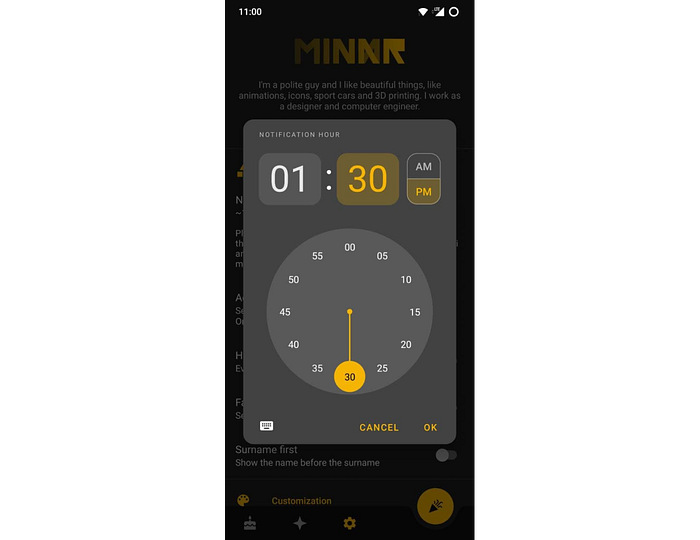
Here’s the final result. When the row is clicked, the time picker opens and the selection is managed flawlessly. The picker will appear a bit different in your app depending on your theme/colors, i’ll partially cover this topic in the last, bonus section of the article. The “AM/PM” chooser will only be visibile if the device uses the 12h time format, obviously.
Bonus: theme the time picker!
The timepicker can be themed to to match the other dialogs in the app. While a basic theming is covered in the documentation (mostly color related) to theme the corners and the background you’ll need some additional theming. Here’s my theme:
<!-- Base app theme -->
<style name="AppTheme" parent="Theme.MaterialComponents.DayNight.NoActionBar">
...    name="materialTimePickerTheme">@style/ThemeOverlay.App.TimePicker</item>
...
</style><!-- Time picker theme -->
<style name="ThemeOverlay.App.TimePicker" parent="@style/ThemeOverlay.MaterialComponents.TimePicker">
    <item name="shapeAppearanceMediumComponent">@style/ShapeAppearance.App.MediumComponent</item>
    <item name="boxCornerRadiusBottomEnd">@dimen/text_field_corner</item>
    <item name="boxCornerRadiusTopEnd">@dimen/text_field_corner</item>
    <item name="boxCornerRadiusBottomStart">@dimen/text_field_corner</item>
    <item name="boxCornerRadiusTopStart">@dimen/text_field_corner</item>
    <item name="colorSurface">?android:colorBackgroundFloating</item>
</style><style name="ShapeAppearance.App.MediumComponent" parent="ShapeAppearance.MaterialComponents.MediumComponent">
    <item name="cornerSize">@dimen/rounded_corners</item>
</style>
This will basically round the dialog corners and the text field corners, and will use a lighter grey for the background (the default is darker than the standard preference dialog).
That’s pretty much all i had to say! The full source code for this and other custom preferences is in this repository, check it out and feel free to leave a star ⭐ if you want ;)


